Difference between revisions of "DuxWare Release Note - 06/06/2021"
| Line 67: | Line 67: | ||
Jump to Schedule Appointment: | Jump to Schedule Appointment: | ||
| − | [[File:D8.png| | + | [[File:D8.png|50px]] |
Edit Appointment: | Edit Appointment: | ||
| − | [[File:D9.png| | + | [[File:D9.png|50px]] |
View Patient’s Dashboard: | View Patient’s Dashboard: | ||
| − | [[File:D10.png| | + | [[File:D10.png|50px]] |
View Balance Summary: | View Balance Summary: | ||
| − | [[File:D11.png| | + | [[File:D11.png|50px]] |
Don’t worry; you can put your mouse pointer over the icon, and it gives you the description of its purpose. | Don’t worry; you can put your mouse pointer over the icon, and it gives you the description of its purpose. | ||
Revision as of 20:33, 28 May 2021
Introducing the DuxWare Dashboard…
Mark the date: June 7, 2021
The DuxWare Dashboard has successfully passed its beta release, and is now ready for deployment to all DuxWare databases. It provides instant and customizable access to critical areas in your system, such as:
• Appointments • Messages • Reports • Daily Summaries • and more
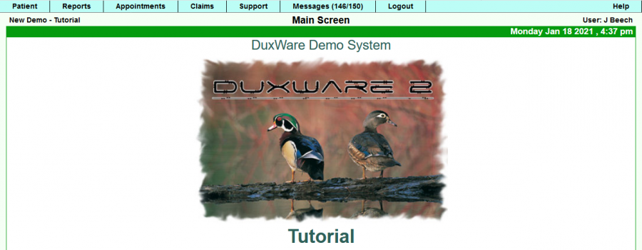
We are excited to announce that our next DuxWare system update will have our new Dashboard June 7, 2021. Once our users log into DuxWare, they are accustomed to seeing the DuxWare Welcome Screen with our logo. See the screen shot below:
The next PM release cycle will update the above screen to the new Dashboard by user role:
• Front Desk (User levels 1-3) • Billing (User level 4) • Management (User level 5)
Note: Please keep in mind that the Dashboard does not in any way keep you from accessing any data that you normally have access to now. All of the top tabs of DuxWare retain the current functionality.
The Dashboard is an added bonus view and functionality to the features already available to you.
Upon release, a user will see the dashboard that is defaulted to their own user level/job role. The dashboards can be customized to view different reports and views, and you will have options to choose from to personalize your own dashboard. All information that is displayed on the individual user’s dashboard is subject to the permissions set by your management. We encourage you to provide us with your valuable feedback.
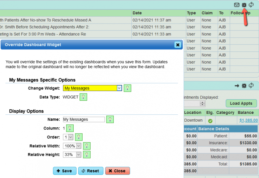
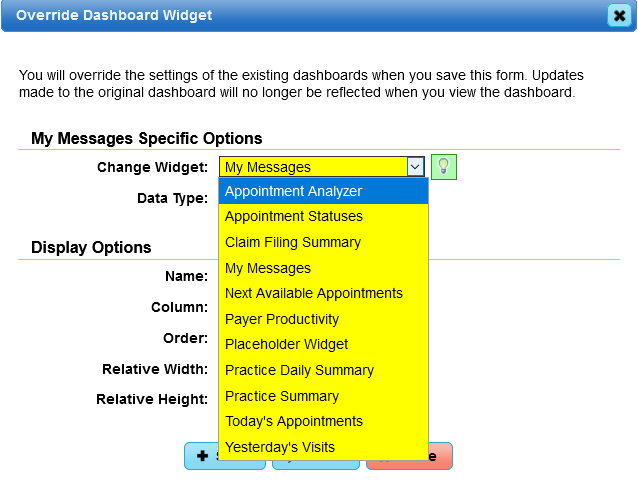
Each Dashboard has a set of default widgets that can be interchanged, re-sized and moved around on your Dashboard to your liking.
Example Widget Settings. We suggest that you discuss dashboard edits with your manager to ensure that you have the appropriate user level or permission to view the widgets available.
Widget options currently available:
Front Desk Dashboard (User Levels 1-3):
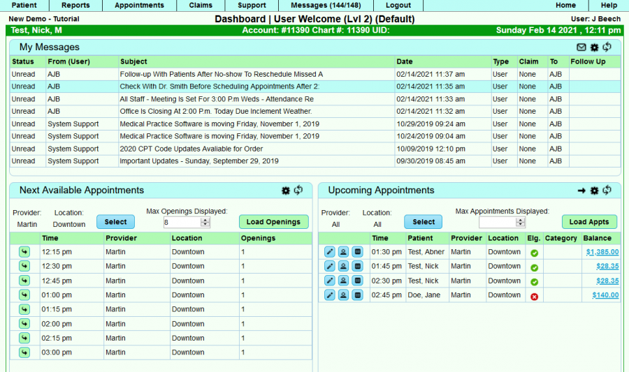
Dashboard Widgets that you will initially see as a L1-L3 user are:
- My Messages
- Next Available Appointments
- Upcoming Appointments
Icon refresher:
Don’t worry; you can put your mouse pointer over the icon, and it gives you the description of its purpose.
Widget: My Messages
This widget will only display “unread” messages as a default, but you can select the envelope icon to toggle to see all messages and follow-up messages.
Widget: Next Available Appointments
This widget will display the next available appointments by a single provider/location or by multiple providers/locations with the ability to jump to the Appointment Schedule.
Widget: Upcoming Appointments
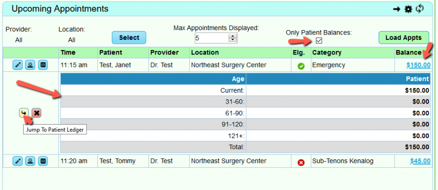
This widget is helpful to the Front Desk as well as Medical Assistants to get a glance at the upcoming appointments to be better prepared for the visit. You can quickly view a single provider/location or multiple providers/locations by using the [Select] button. From this widget you can also edit an appointment, View the Patient’s Dashboard as well as View Balance Summary. To view only patient balances, click in the box underneath “Only Patient Balances”, then [Load Appts]. To view Account balances, uncheck the same box, then [Load appts]. The system will remember your last selection.
In this example, the balance was selected for the first patient. Once that occurs, a pop-up of the patient’s balance summary appears with the option to “jump to” the patient’s ledger, or close the pop-up window.
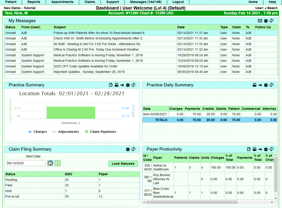
Widget: My Messages
This widget will only display “unread” messages. We find that the billing staff make the most of the messaging system as a tickler for following up on outstanding claims.
Widget: Practice Summary
From this widget, you can quickly see Charges, Adjustments and Claims Payments with a graph.
It also provides the user the ability to export the report, print the report, go to report, edit the widget and refresh as indication in the icons from left to right below:
Widget: Practice Daily Summary
From this widget, you can see, at a glance the current status of charges, payments, credits, debits…. The user also has the ability to export and jump to the report.
Widget: Claim Filing Summary
This widget provides the totals of all of the claim statuses from the “Start Date” in the date window to current. The calendar date can be updated.
Widget: Payer Productivity
Displays the activity of the top payers in your system with the ability to export the report and jump to the report.
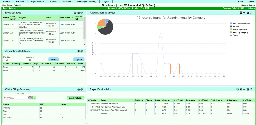
Management Dashboard (User Level 5):

